

What is the difference between primary, secondary, and tertiary buttons?
Squarespace makes it easy to set primary, secondary, and tertiary buttons for your website.
But what are the differences between these buttons and how do you use them effectively on your website?
Overview
UX designers use primary, secondary, and tertiary buttons to help users complete the most important tasks on a page.
The actions assigned to buttons depends on the strategy for that particular website. In other words: what the UX design/product/business teams have determined are the main goals and what a user needs to do to meet those goals.
Primary buttons
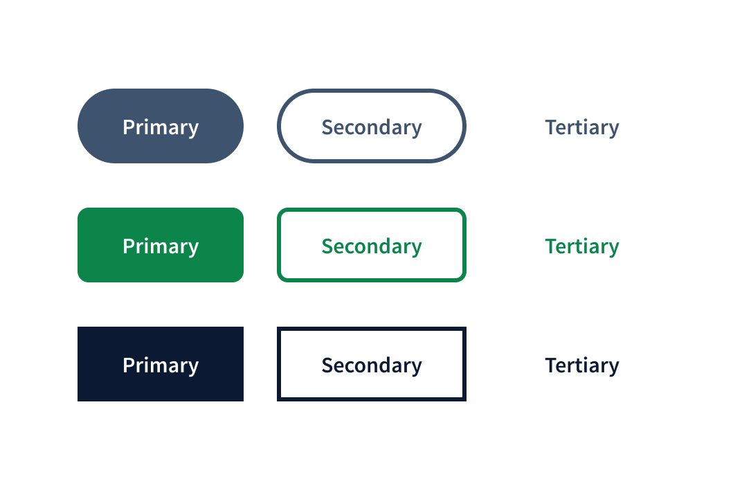
Primary buttons represent the most important action for a user to take on the page. They should make it quick and easy for the user to find what they need to do because primary buttons jump out on the page.
Characteristics of primary buttons
• Solid colors that are typically dark or bold—but not red. Why? Red buttons will certainly jump out but red is usually reserved for communicating a warning and might make users uneasy about clicking.
• Short CTA (Call to action) that tells the user what to do. For example: Start Here, Submit, Complete, Learn More, Schedule a Call, Buy Now. Each button on the page will have a CTA but the primary button can only have one CTA per page.
Example
Take a look at the homepage for the project management tool Asana. Notice the big, bold, black button that says Get Started in the navigation at the top as well as in the hero space. This is the primary button for their homepage.

Note that:
• Even though they use the primary button more than once on the page, it is always a black with white type and the same Get Started CTA.
• They chose to make Get Started their primary call to action even though are other clickable areas on the page including Why Asana, Features, Pricing,
Secondary buttons
Secondary buttons are used for the second most important action/s on the page.
Characteristics of secondary buttons
• Same color as the primary button but with an outline instead of a solid color.
• Short CTA similar to the examples given for primary buttons. Unlike primary buttons, though, there can be more than one secondary button on a page.
Example
This is a good example of how secondary buttons and primary buttons work together. Notice that the preferred action here is still Get Started but now there is a Watch Video secondary button. This makes sense because watching the video would help a prospective subscriber decide to get started. The task named in the secondary button’s CTA supports the task named in the primary button CTA.

Tertiary buttons
By now you probably see where I’m going here: tertiary buttons are third on the list of priorities determined for the page. They are used less often than primary and secondary buttons and often not at all. But they are still a really important tool that UX and UI designers use to help users navigate a page.
Characteristics of tertiary buttons
• The CTA text is the same color as the primary button but tertiary button do not have a color fill or outline. So they look like clickable text but they are still a button because they are coded as a button so that screen readers can detect them.
Example
This is a mockup (below) of a tertiary button that I created. We’ve probably all seen something similar out in the wild—on a modal or pop up that might be shown in the course of submitting some information.
In this scenario, the user has reached the final step and the primary button says Submit because that is the main task for this flow.
However, as good ux designers we assume that, even though we want our user to complete this task, it is possible that they might choose not to continue. In that case we need to give them an option to cancel. We want that option to be available but less prominent so combining a tertiary button with a primary button is a common choice.

Wrap up
Now that you know the difference between primary, secondary, and tertiary buttons in ux design, pay attention to how difference websites use them. Are they being used correctly or effectively? What you can learn about the business’s strategy and priorities based on how they use buttons?
Questions or things to add? Let me know in the comments!